404 Error Pages and User Experience

Every internet user knows the disappointment of clicking a link only to land on a “404 – Page Not Found.” This error page indicates that the content you tried to reach isn’t available – essentially a dead end. Too often, these pages are an afterthought, displaying a generic apology (or just a code) that leaves users frustrated. In reality, a 404 page can be much more.
In 2025, with user expectations higher than ever, the humble 404 error page has become a critical piece of the user experience.
What Are 404 Pages and Why Do They Occur?
Simply put, a 404 page is a webpage shown when the server cannot find the page a user requested. In web terms, “404 – Not Found” is an HTTP status code meaning the server is reachable, but the specific URL path doesn’t point to any valid content. In plain language, it’s the web’s way of saying “Oops, we can’t find that page.” This can happen for a few reasons: the page may have been moved or deleted (without a proper redirect), the link may be broken, or the user might have typed the URL incorrectly. For example, if a website reorganizes its content or a product is removed, any old links could lead to 404 errors. Even a simple typo in a link can send someone to a non-existent address.
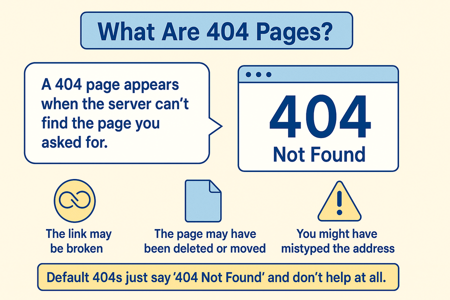
By default, many web servers just display a very basic 404 error message – often just the code “404” and “Not Found” – with no design or guidance. The problem is that such default error messages are not user-friendly.
Why Custom 404 Pages Matter for UX, Trust, and Retention
From a user-experience standpoint, a bad 404 page is more than a minor annoyance – it’s a trust breaker. When someone lands on a broken page and finds no help or direction, it creates frustration and disappointment. The browsing flow is disrupted, and the user may question the reliability of the site. In many cases, they won’t stick around to investigate further.
In other words, a single unresolved “Page Not Found” can cost you a potential customer or reader in a matter of seconds. Repeated errors are even worse: if users keep stumbling into broken links, it tarnishes their perception of the brand’s quality and reliability. One analysis found that sites plagued with excessive 404 errors experienced a measurable drop in user trust (around 12% decline). After all, if a website can’t even serve its pages properly, visitors may wonder what else is wrong – Is the content outdated? Is anyone maintaining this site?
Now flip the perspective: what if, instead of slamming into a wall, that user found a helping hand on the error page? This is where custom 404 pages come in. A well-crafted 404 page can turn an otherwise negative encounter into a neutral or even positive one. Rather than eroding trust, it can actually reinforce it. When users see that a website anticipated their problem and is ready to assist them (with links, explanations, or a bit of friendly humor), it sends a reassuring message: the site cares about their experience.
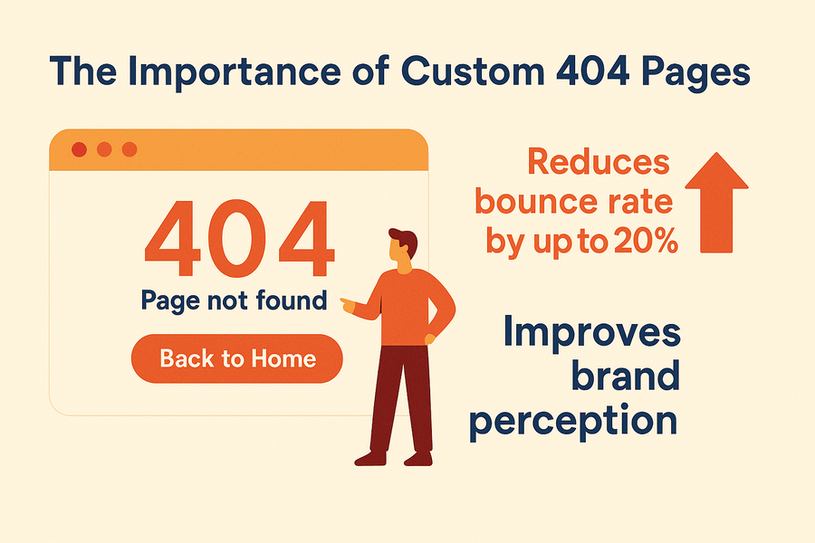
Importantly, customizing your 404 page can directly improve user retention. By providing pathways back into the site, you can often prevent the visitor from bouncing away.
The logic is simple: if the error page gives the user something to do – a route to find what they wanted or explore other content – there’s a higher chance they’ll stay on your site. In competitive digital markets, retaining even a fraction more visitors can make a real difference. Moreover, a thoughtful error page can protect your brand’s image. Instead of remembering your site as “the one with broken links,” users might recall how your brand handled the hiccup with grace or even charm.
Iconic 404 Pages That Got It Right
To illustrate everything we’ve discussed, here are two real-world 404 pages (as of 2025) that showcase different approaches to engaging design and good UX. We’ll describe each and see what makes it effective.
1.CanDevsDoSomething
Visit site: https://candevsdosomething.com/
CanDevsDoSomething is a public platform where users vent their frustration about software bugs and ignored feature requests. It’s a site built around the catharsis of complaining about tech, often with humor and a bit of snark. Fittingly, its 404 page carries that tone brilliantly.
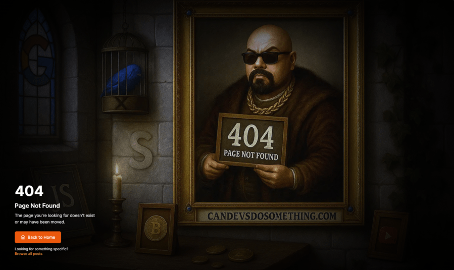
The 404 page of CanDevsDoSomething uses dark, tongue-in-cheek humor to turn an error into an on-brand experience. The design features a darkly comic oil painting of Hard Rock Nick (a social media personality known for an over-the-top persona) portrayed in a medieval tech dungeon, holding a mugshot-style sign – as if he’s been “caught” for a website offense. This absurd scene aligns with the site’s theme of venting about tech frustrations in a playful way.
This 404 page is effective because it delights users with its unexpected artwork and humor, easing any annoyance about the broken link. At the same time, it provides a navigation cue (such as a link back to the homepage or a prompt to explore recent rants) so users aren’t left stranded.
1.Triplette Pizza
Visit site: triplettapizza.com
Triplette Pizza is an artisan pizza brand known for its strong visual identity and creative marketing. They infuse a sense of artistry and fun into their branding – from their packaging to their website visuals. Their 404 page is no exception, using an imaginative design to soften the blow of a missing page.
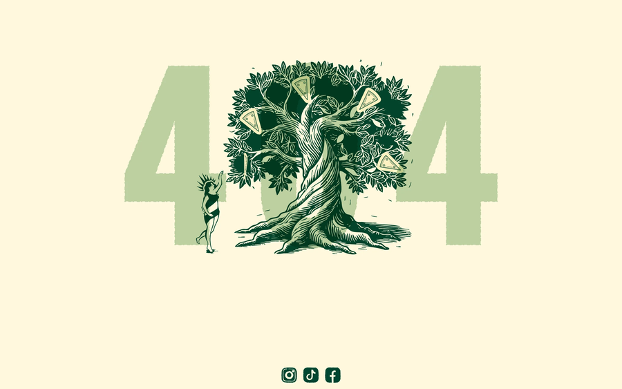
Triplette Pizza’s 404 page greets users with a whimsical “pizza tree” illustration – literally a tree growing pizza slices as if they were fruits. The artwork has a forest-fantasy vibe, with rich, earthy colors and a touch of magic. This creative visual immediately conveys the brand’s personality: playful, foodie, and artistic. It transforms the error into a moment of discovery, as users marvel at the quirky idea of pizzas sprouting from a tree. The page maintains the company’s visual branding through this illustration and the overall design.
What makes this 404 page effective is how it engages the user’s imagination and reinforces brand identity, all while providing helpful navigation. Alongside the illustration, the page includes a clear message (perhaps “That page is missing – maybe it was eaten by the pizza tree!”) in a friendly tone, which both acknowledges the error and ties back to the pizza theme. Quirky style, this 404 page turns a potentially frustrating moment into one that strengthens the user’s connection to the brand.
As shown in examples examples above, effective 404 pages can have vastly different styles (one dark and cheeky, one bright and whimsical) tailored to their brand and audience. Yet, they both succeed by engaging the user, providing clarity and navigation, and turning the error into a unique moment that reflects the brand’s character. In both cases, users are less likely to leave upset; they might even feel more charitably toward the site after seeing the effort put into the error page.
Key Elements Every Effective 404 Page Should Include
What separates a great 404 page from a mediocre one? From research and best practices, we can identify several key elements that effective 404 pages typically contain. Think of this as a checklist for designing your custom error page:
- A clear, friendly error message: Every 404 page should explicitly state that the page isn’t found, in words that average users understand. For example, text like “Page Not Found” or “We can’t seem to find the page you’re looking for” should be front and center.
- Visual branding and design consistency: An effective 404 page carries over the same header, footer, logo, and general style as the rest of your site. Consistency reassures users that they are still within your website and that only the content is missing, not the site’s structure. Use your normal template or a very close variant for the error page.
- Navigation links to important pages: One of the most crucial elements is providing links that guide the user onward. As a baseline, include a prominent link to your homepage. This could be a big button that says “Go to Home” or a line like “Head back to our <a href="/">homepage</a>.” Many sites also list other commonly sought pages. For instance, you might include: Products, Services, Blog, Contact Us, FAQ, or whatever main sections your site has. These act as shortcuts in case the user was generally looking for something in that area.
- Search bar: Providing a search functionality on the 404 page is considered a best practice by many UX experts. When a user is looking for something specific that wasn’t found, their natural next step is often to search for it. By embedding a search bar right on the error page, you save them the step of going to a separate search page or the homepage to use the search. It’s immediate recovery. A search bar on the 404 gives users a sense of control – “Okay, that page is gone, but I can try searching for what I need.” This can dramatically improve task success rates.
- Call-to-Action (CTA): A CTA on a 404 page is a prompt that encourages the user to take a specific action that benefits both them and you. While the primary CTA is usually “go back to something useful” (like home or search), you can also use this space creatively. For instance, you might invite the user to contact support or report the broken link (“Let us know about this issue”). On commercial sites, some use the 404 page to promote popular products or content, effectively saying “we’re sorry you hit a snag, but here’s something you might like.”
- Helpful and contextual imagery or illustration: While not strictly necessary, most great 404 pages include some visual element that is both on-brand and related to the idea of an error or lost content. This could be a mascot illustration (e.g., an empty shopping cart looking sad, or a character with a map who’s lost), a relevant photo, or even an animation or small game.
- Consistency with brand voice and tone: This is more of a holistic element. The text and approach of your 404 page should align with your brand’s voice. If your brand is usually formal and trustworthy (say a bank or a medical site), your 404 should be polite, possibly apologetic, and reassuring (“We’ll help you find what you need.”). If your brand is fun and edgy (like a gaming site or a youth-focused brand), your 404 can be more irreverent or humorous.
- Proper technical behavior (behind the scenes): From a user’s perspective, you generally can’t see this, but it’s worth noting: a good 404 page still returns a 404 status code to the browser/search engine. This ensures that search engines know the page was not found (so they don’t index it as actual content) and that any automated processes recognize it as an error page. Also, no matter how fancy your 404 page is, it shouldn’t break the back button or trap the user. If a user navigates to a 404, they should be able to hit “Back” to go to their previous page reliably.
To recap this checklist: a great 404 page will tell the user in friendly terms what’s up, look like it’s part of your site, give them ways to fix the issue (via links or search), perhaps entertain or charm them a bit, and prompt them toward a useful action. If you include these elements – clear message, consistent design, navigation links, search, a gentle CTA, and some personality – your 404 page will be well-equipped to turn a potentially negative experience into a positive engagement.
Conclusion
In the digital landscape of 2025, where user experience is paramount and attention spans are razor-thin, no detail of a website is too small to optimize – not even the error pages. A 404 page may seem like a minor, seldom-seen corner of your site, but as we’ve explored, it carries disproportionate weight in shaping user impressions. Handling a “Page Not Found” gracefully is both an art and a science: it requires empathy for a frustrated user, solid UX design to guide them, and a dash of creativity to leave a positive mark. When done right, a 404 error page isn’t just a technical necessity; it becomes an opportunity to surprise, delight, and re-engage your visitors. It shows that your brand cares about the user experience at every step – even the missteps.